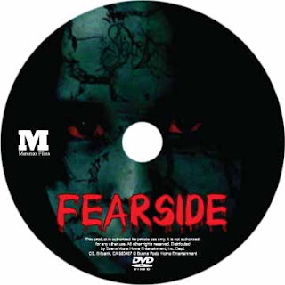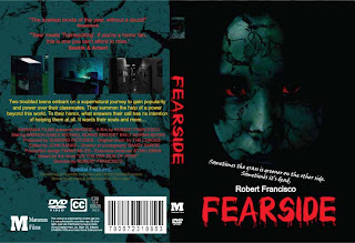

This is my assignment about film DVD cover. It took me about one day to finish.
 source from:http://www.adpunch.org/images/wwf-global1_25.jpg
 source from:http://adsoftheworld.com/files/images/PosterTiger40x60engls.preview.jpg
 source from:http://img.visualizeus.com/thumbs/08/02/02/color,composici%C3%B3n,realismo,poster,%E5%B9%BF%E5%91%8A,%E6%A0%91-7d6374a98b2f010ca1f61b4704db3ddc_h.jpg
 source from:http://www.gibbons.de/main/introduction/pics/9-6a.jpg
 source from:http://www.wwf.org.hk/images/conservation/species_conservation/napoleon_wrasse/c_spec_nw_poster_b.jpg
 source from:http://www.frederiksamuel.com/blog/images/wwf_planet_1.jpg
 source from:http://s3images.coroflot.com/user_files/individual_files/124954_X0LJq0tGOSPmxrGHQeQT50hUr.jpg
 source from:https://blogger.googleusercontent.com/img/b/R29vZ2xl/AVvXsEgKD9tXTCuerxtyD7t_84HGYkzRDtWyPfOXqbg5OwAyG7Vu48aoVMlau_AMB8pIgfRzPWryFWuh1r2epJepJKjZzf9nHLfgNwyx8LYcMhK8Slz2zRVSlDdoAMo8xfDxt_vd1KK7jCx0XpYQ/s400/wwf_poster.jpg
 source:http://www.dforceblog.com/imagenes/poster-wwf-calentamiento-global-4.jpg
 source from:http://www.zda.vn
 In this lesson we will create a Coke Splash effect by using some filters and custom made brush to give effects.
Final result of the Coke splash effect.

coke splash effect final
Open a document 500 x 500.
Create two layers and apply black color to one layer and name it ‘Black’.
Select a hard brush 13px . On the brush settings - modify the to the following.

Select red color (#bc0000). Make a splash effect by drawing the outline like below. Hide the black background layer. This will be useful in the following step.

From the filters gallery apply “chrome” with the settings below.

The brush strokes has been taken a new splash effect. The color has been changes to grey.

Now bring back the black BG which has been hidden to visible.
Select the magic want (B), change the tolerance to 12, anti-alias. and select the white part.
From the Select Menu, select the “Similar”. Press delete to remove the white selections.

Press crtl+U to open the hue/saturation settings. Now lets apply some color to it from the following.

To change the levels of the colors, press ctrl+L. Change the levels to following to give a more live colors.

Duplicate the splash layer and place it to make a complete splash like below. Transform and scale a little and change the angle to give a realistic spray effect.

Tips: You can give a better finishing to the splash by closing the ends.
Now take a bubble brush and with the same settings first we used start drawing along the splash.

Next give some glow to the form.
Take a hard brush 9px. Change only the scattering of the brush to 500%. Start drawing along the splashes.

Apply outer glow.

Make a shape like below and fill it with white. Apply Gaussian blur.

Place the layer just above the black BG layer. Change the transparency level to 70.

Now we will take a can image, and place the effect on top of that.

Place the can in the lowest layer , above the black BG.
Create a new layer just above the black BG layer.
Change the foreground color - #a40a2a and background color - # 662d91.
Go to the filters and apply radial blur . Move the slider to max and select the method to zoom.

Apply halftone from the filters gallery (default settings).

Place the can below the splash carefully.

The end results.
Ok sorry but I can only use this way to add a comment because there is someting wrong when I am trying to click Comment button.
Well just to say Great Tutorial, hope that the others will ride your page...
source from:http://www.tutorialized.com/view/tutorial/Create-a-Coke-Splash-effect-in-Photoshop/41669


 This is my exercise about modern magazine that I see in one website and do as same.


